The problem
Making complex energy management concepts accessible to the public by transforming them into simple, user-friendly interfaces.
This project was assigned to me by TechBricks, the Venture Studio I work for.
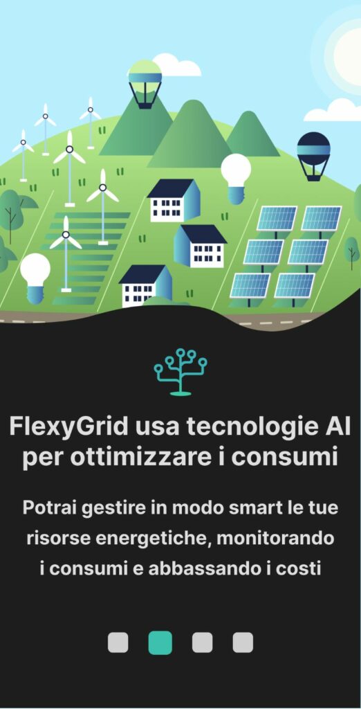
FlexyGrid creates and manages Renewable Energy Communities in all steps, leading at best the transactions of production, consumption and accumulation with economic benefit of all actors of the energy system, including residential users, industrial and electric mobility ⚡
My role involved full-cycle project development, from conducting competitor analysis to creating personas and interviewing users to ensure our platform truly addressed their needs. Also I was involved in the Marketing Promotion via social media, mail marketing and offline advertising.
I created also some Landing Pages, launched with Meta & Google Ads campaigns targeting individuals, SMEs and local or regional authorities.
➡️ Landing page Comunità Energetiche Rinnovabili (SMEs)
➡️ Landing Page Preventivo impianto fotovoltaico (Individuals, SMEs and authorities)
➡️ Landing page Fotovoltaico aziende (Medium to large companies)
➡️ Landing Page Bando Energia per le imprese nella Regione Lazio 2024
➡️ Landing page Bando CER Camera di Commercio Roma 2024
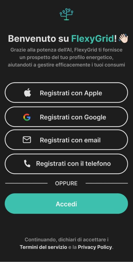
I'm currently working on designing the FlexyGrid Dashboard and a Mobile App on Figma.
You can see FlexyGrid website here!
A minimalist layout ensures a smooth interaction, reducing cognitive load, while interactive graphs and live reports enhance clarity and accessibility.
This design approach provides users with a seamless experience for optimizing their energy resources.


By presenting key information through interactive graphs and modular widgets, the dashboard enables users to make informed, data-driven decisions in real-time.
The Dashboard interface uses contrasting colors and a modular layout to segment data logically, ensuring that even complex insights are immediately understandable.
© 2021. All rights reserved to Luca Rinonapoli
Privacy Policy
| Cookie | Durata | Descrizione |
|---|---|---|
| cookielawinfo-checbox-analytics | 11 months | This cookie is set by GDPR Cookie Consent plugin. The cookie is used to store the user consent for the cookies in the category "Analytics". |
| cookielawinfo-checbox-functional | 11 months | The cookie is set by GDPR cookie consent to record the user consent for the cookies in the category "Functional". |
| cookielawinfo-checbox-others | 11 months | This cookie is set by GDPR Cookie Consent plugin. The cookie is used to store the user consent for the cookies in the category "Other. |
| cookielawinfo-checkbox-necessary | 11 months | This cookie is set by GDPR Cookie Consent plugin. The cookies is used to store the user consent for the cookies in the category "Necessary". |
| cookielawinfo-checkbox-performance | 11 months | This cookie is set by GDPR Cookie Consent plugin. The cookie is used to store the user consent for the cookies in the category "Performance". |
| viewed_cookie_policy | 11 months | The cookie is set by the GDPR Cookie Consent plugin and is used to store whether or not user has consented to the use of cookies. It does not store any personal data. |
ㅤ